Quickbase Futurebase
—Futurebase is a concept of what a modernized version of Quickbase would look like, with a visual overhaul based on our design system and past research, improved navigation, and addressing common customer issues.
—Futurebase is a concept of what a modernized version of Quickbase would look like, with a visual overhaul based on our design system and past research, improved navigation, and addressing common customer issues.
In January 2021, Quickbase hosted an internal hackathon that took place over 2 days. My goal was to showcase the value of design to an engineering-led product organization. I also aimed to generate excitement for the future and provide a rough north star for the company to follow in future work. With that in mind, I chose to re-imagine Quickbase's navigation and teamed up with an interaction designer and a content writer.
No1 · I explored different navigation styles based on previous research/wireframes.
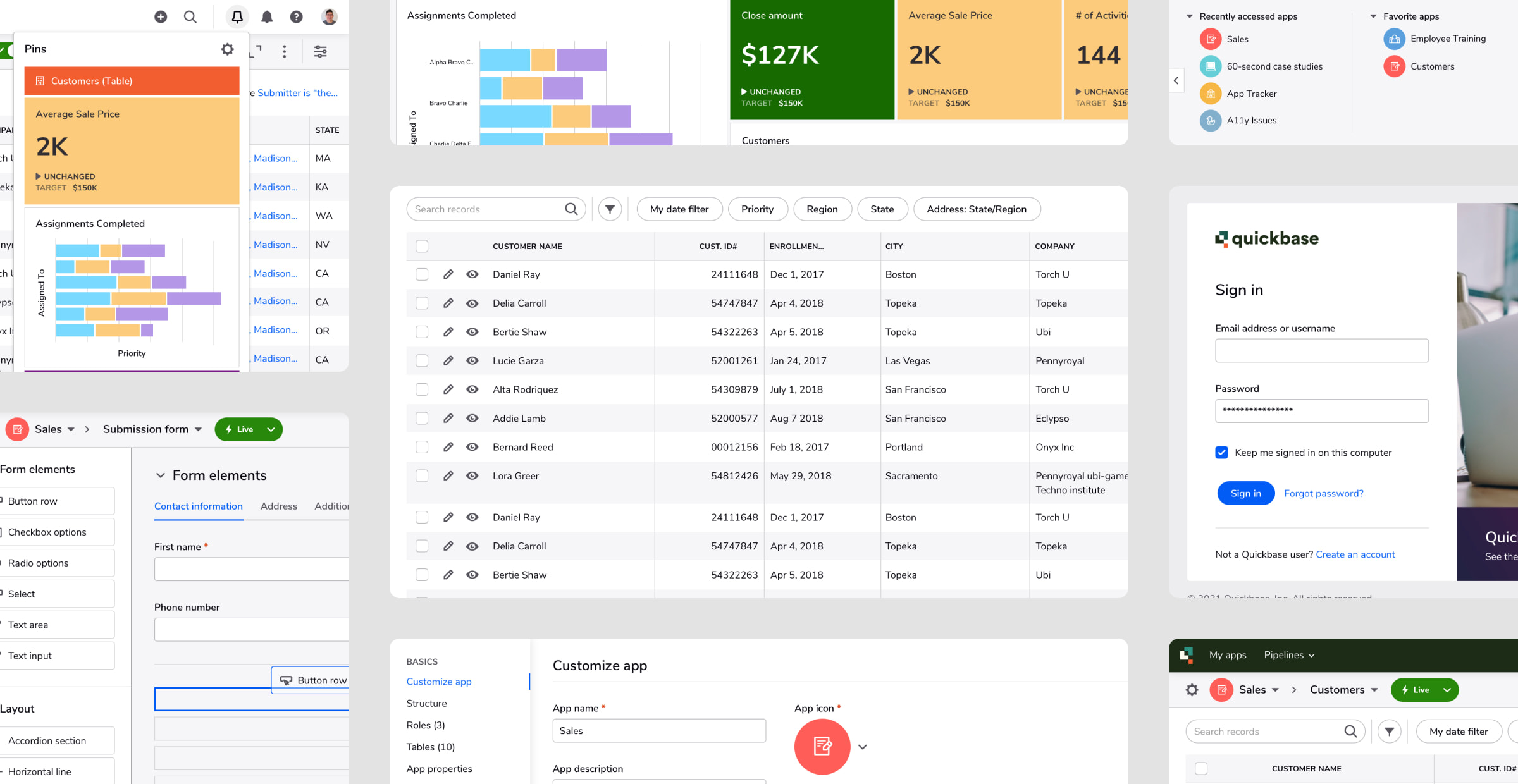
Customers often request that we display more data on the screen at once. This led me to investigate the screen resolution sizes of our user base. Surprisingly, one-third of our users still use resolutions below 1280px in width. This width typically has 1024 as the height. From this, I aimed to reduce the height of the navigation as much as possible.
We have also received feedback that our platform lacks a modern look and feel, some of which is over 20 years old. The outdated visuals have affected customer adoption in some cases. Improving the user interface is also aligned with our larger organizational objective of making it more delightful for users. To address this, I ensured that the re-design used our design system, utilized existing components as much as possible to reflect what could actually be built in the future, and improve consistency.
I also had to consider Quickbase's recent rebrand. As part of this process, I explored different color variations to determine the default, non-customized navigation style and if we should incorporate the rebrand colors into the product.
I explored two different navigation orientations based on previously conducted usability studies: a vertical, icon-only side navigation and a more conventional top navigation. Our team discussed the advantages and disadvantages of both approaches since there was no strong preference either way from users on the tested layouts.
We moved forward with a top navigation because it gave us more room for text and labels and the side navigation isn't as straightforward to use without an expanded state for labels.
No2 · The final designs would help inform the direction of our Quickbase navigation re-design project.
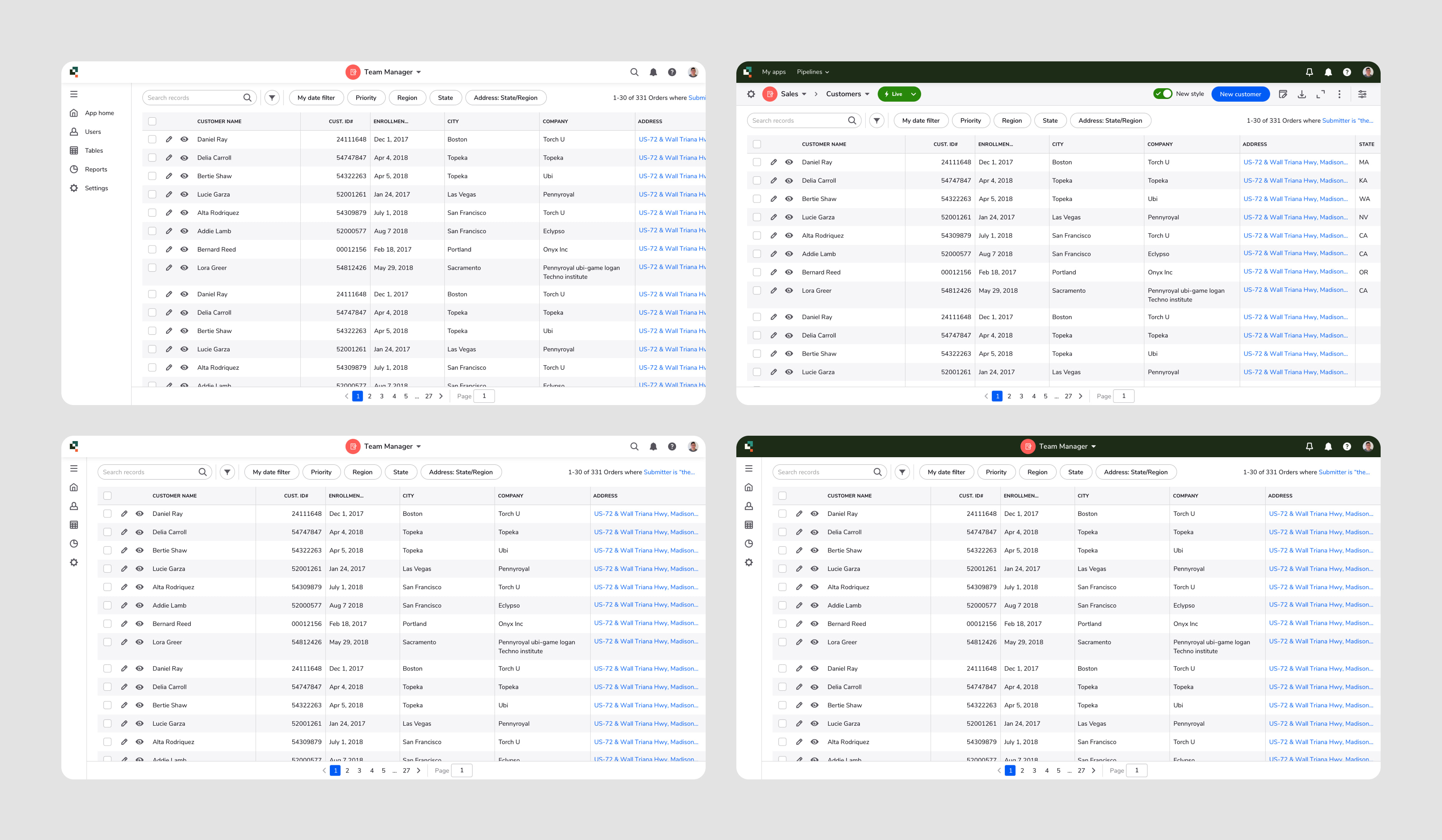
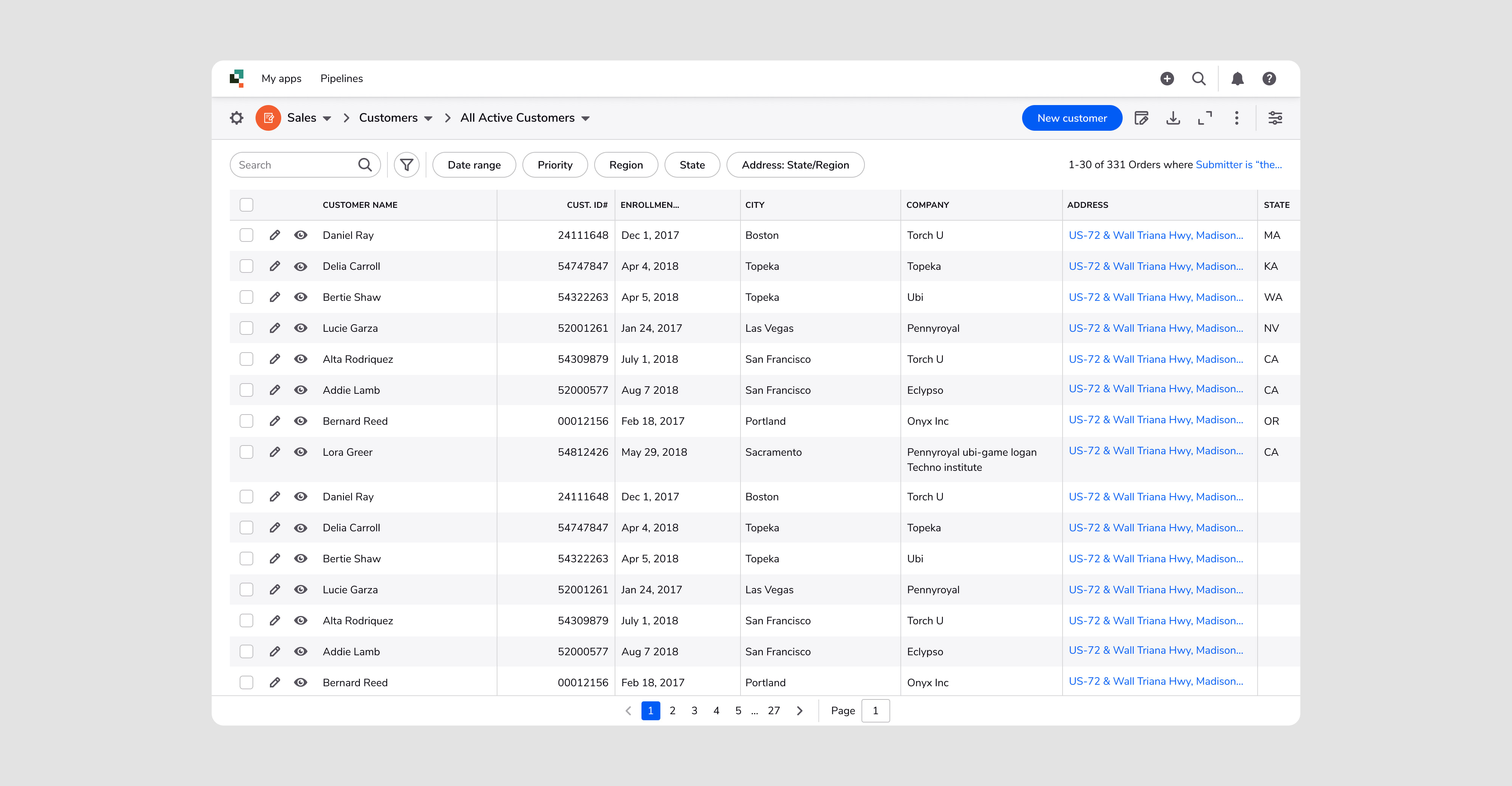
In the final version of the hackathon navigation, I reduced the header height by 48%. This will significantly improve data density for our users, particularly for those using small screen resolutions that I had looked into before.
I updated the look of as much of the top-level UI as much as I could, from the way data tables look to what our help popover looked like, with an emphasis on reducing data density so that useres can focus on their work.
Our interaction designer focused on incorporating end-user defined navigation, which let users open a popover from the main navigation that let them see items that they've pinned. Pinned items can be anything from charts, to buttons to start workflows, to widgets from Quickbases' dashboards. I worked with the designer to integrate this into the overall framework of the global navigation.
3rd
Placement out of 11 teams
48%
Reduction in navigation height for improved data density
This level of designing within 2 days? Incredible.
Through Futurebase, we demonstrated the value of design to an engineering-led organization and achieved our intent of generating enthusiasm throughout the product organization.
More than a year later, after investigation into the implementation effort and prioritization of modernizing the product's UI, Futurebase became the foundation of the Quickbase navigation re-design.