Quickbase Report Settings
—Editing report settings in Quickbase is an essential part of the platform allows users to build and customize views of their data to help them get insights that they need.
—Editing report settings in Quickbase is an essential part of the platform allows users to build and customize views of their data to help them get insights that they need.
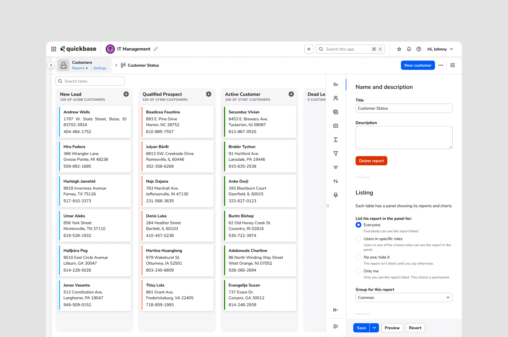
In Quickbase, users have data in tables within their app. To build a report in Quickbase and view their data in different ways (as kanban boards, charts, etc.), they currently have to navigate to a separate page to change settings and then go back and preview what they have. We received feedback that users were going back and forth between pages 1 out of every 4 times that they access report settings, which made for a very clunky experience.
How can we keep users in context of their work while maintaining the power of the current settings page and improving usability? The team settled on using a panel to accomplish this.
The scope of the project was kept narrow: keep the capabilities of the current settings page, but move them into the panel so that we could build and test as needed. We started designing the report settings for our kanban view, which is complex enough to have most of the settings that other views do.
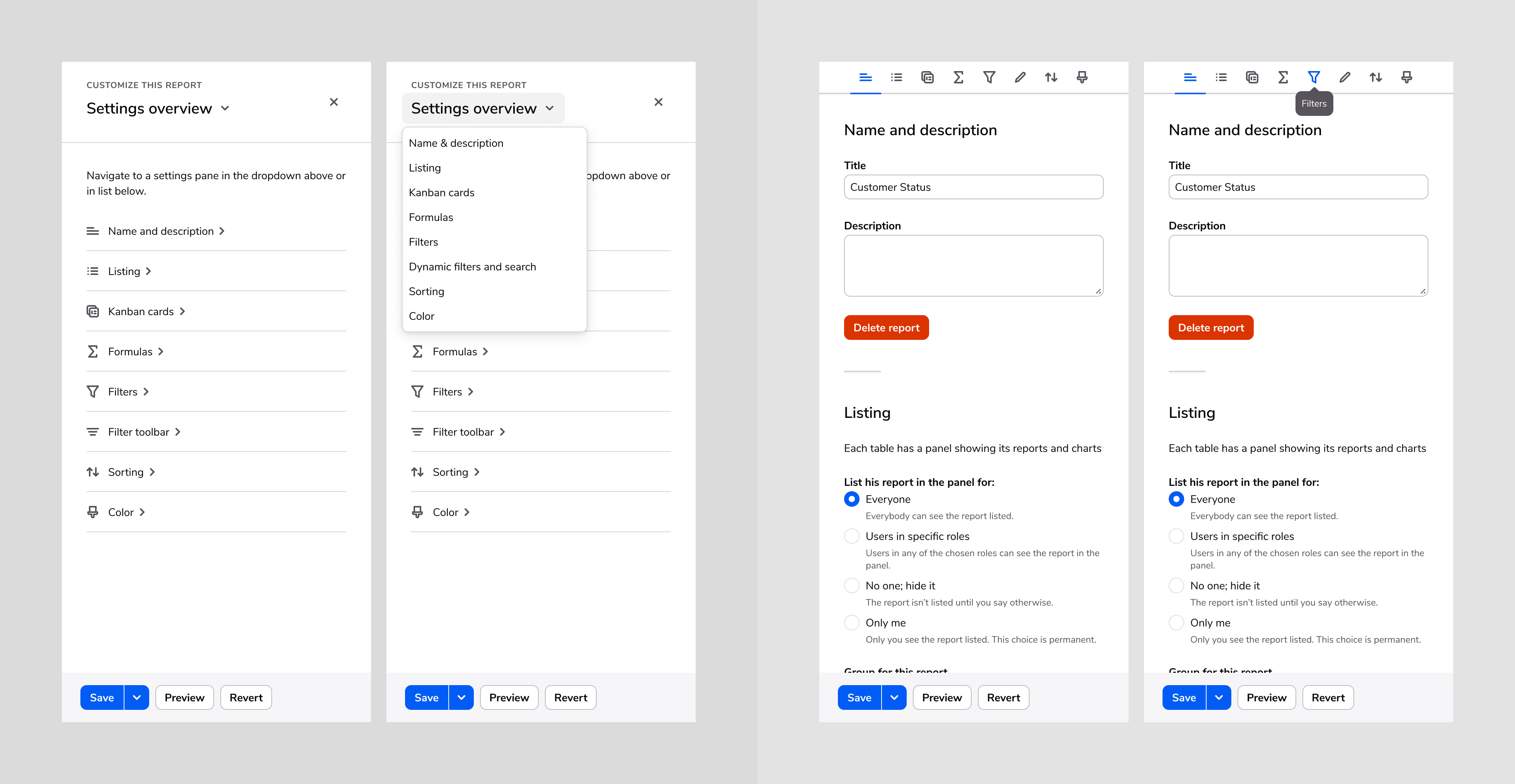
One thing that we struggled with was how to display all the different settings that the panel contained, how to navigate through them, and if users preferred seeing their changes live or when they clicked “Save” or “Preview”. I refined two design variations and ran usability studies with Quickbase users to see what worked.
The study involved running ten users through the same tasks with two different designs and we used the single ease question (SEQ) and user comments to compare the designs.
I think at first it was a little confusing on what exactly each of the icons mean. But I think if I were very familiar with it and using it all the time, I think the tabs would be faster to use.
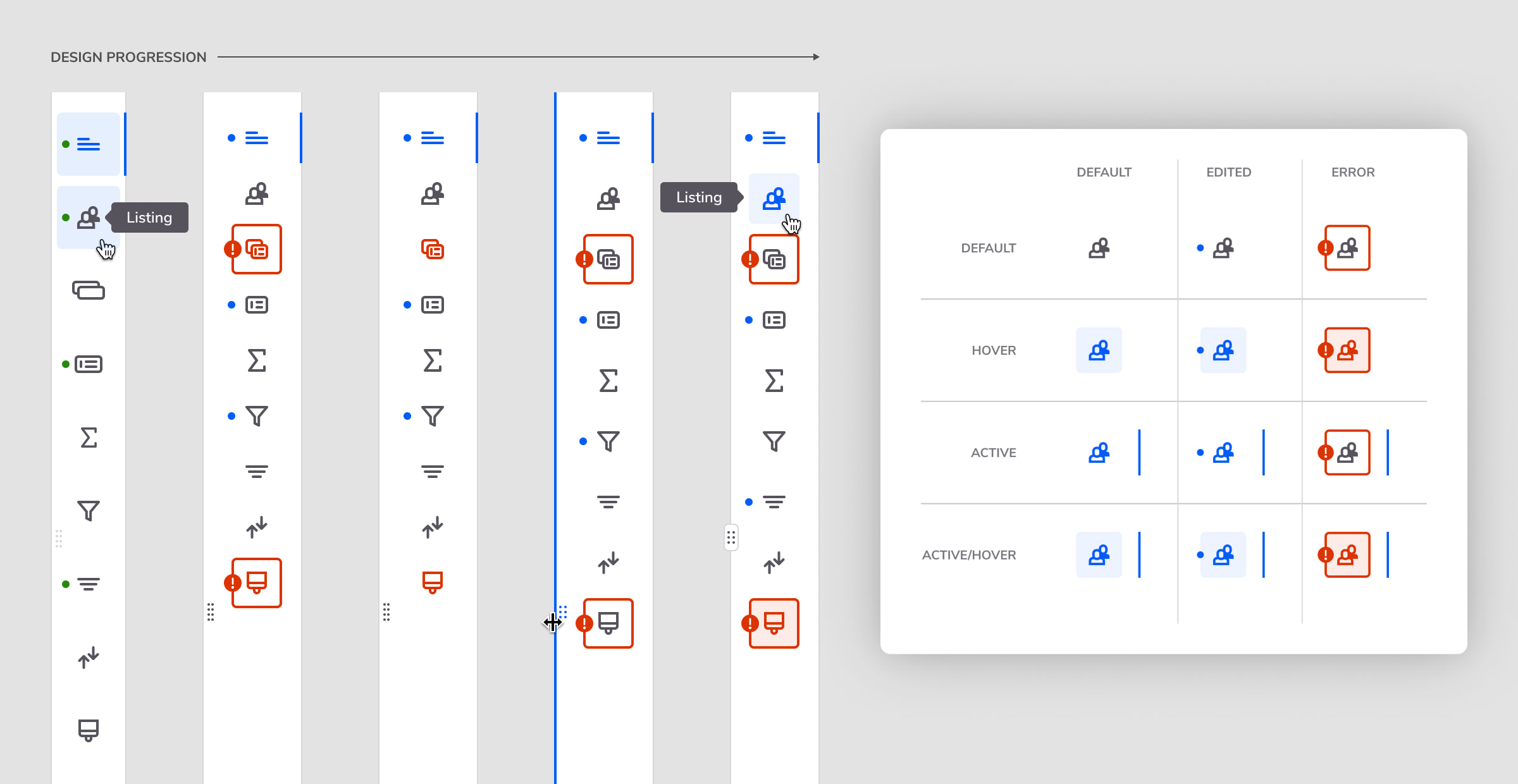
From my research, I found that the dropdown navigation was not discoverable enough, with so many page elements and not enough affordance to let users know that the heading contained a menu once clicked. The tabs tested better because all the sections were laid out, but there were still issues with knowing what icons meant and fitting more sections and tabs in if needed.
Users were evenly split on whether they wanted to instantly preview changes or click “Save” or “Preview”, so we opted to force users to select those options before being able to see changes for performance reasons.
After the study concluded, our design team went through a re‐organization and the current interaction designer and I were moved to focus our efforts on other teams. The team kept exploring, building, and testing in my absence.
After a few months and more internal team changes, I was re‐assigned to the report settings project again. A visual designer provided initial specs for the new tab system that the team built in time for our internal conference. However, there were other design considerations that needed refinement with the tab navigation:
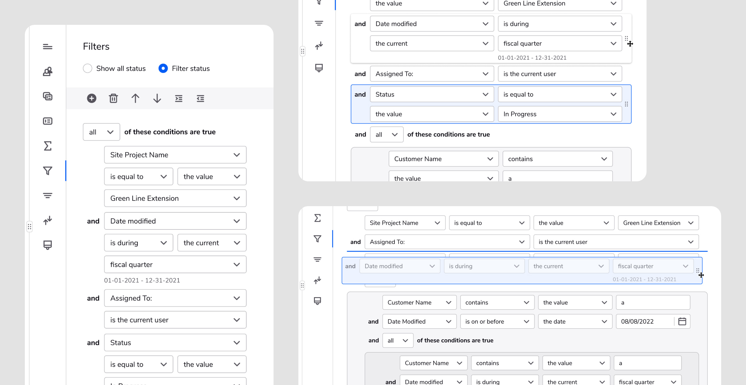
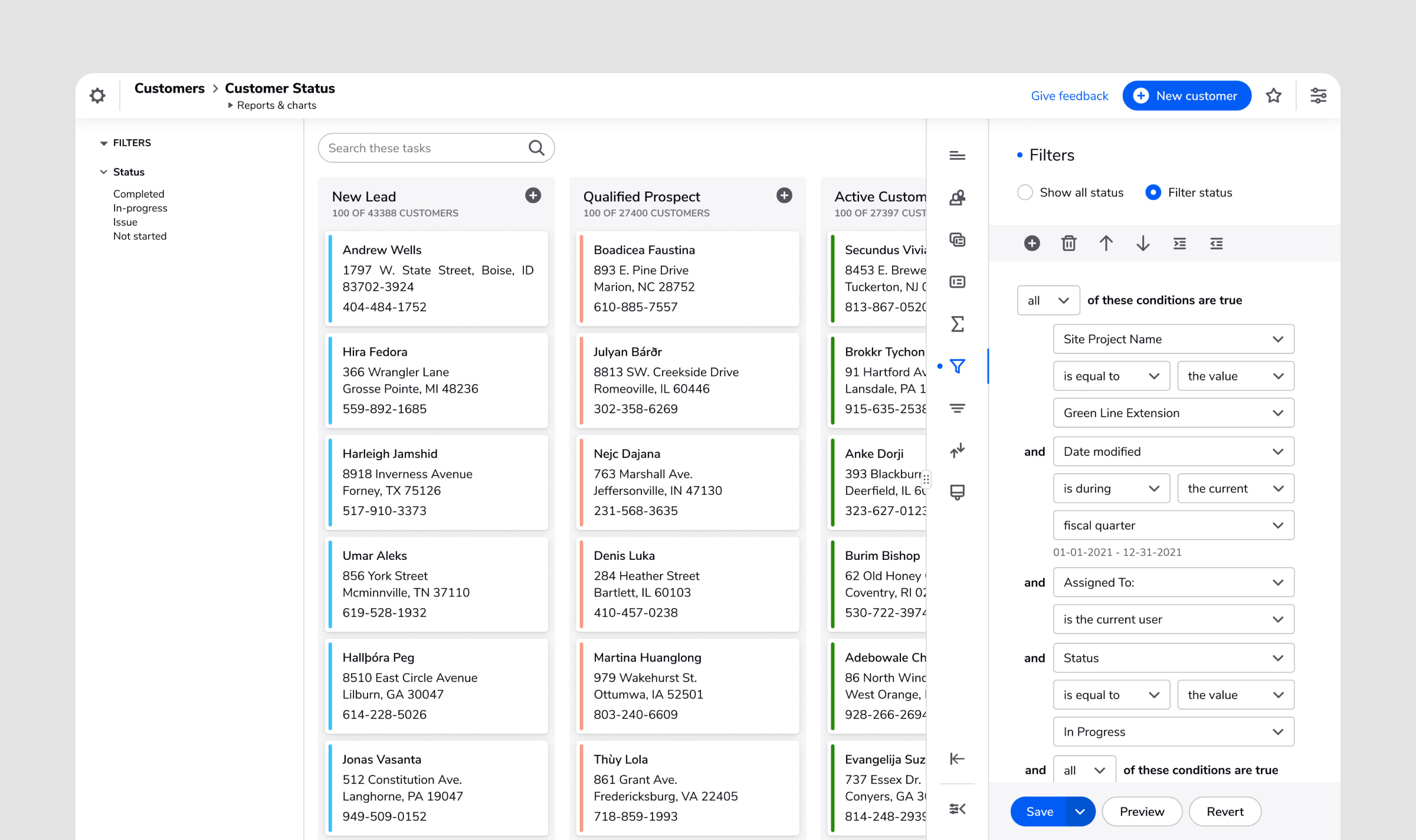
Another challenge was to re-design and re-build the filtering experience, which allows users to finetune their report based on logic that they define.
Filtering was one of the areas that got more difficult to use once the report settings moved into a panel rather than a full page.
Things that were done:
I do like being able to edit the report and still see the report rather than bouncing back and forth between pages. I think that helps my mind connect some of those dots.
The report settings panel has been shipped and will serve as the foundation for other report settings as work progresses for those features.